Thor has a multitude of posters. Some of them good, some bad, some with good foundations, and some that are questionable. The coloring and composition of the photos are excellent. The colors are dark, rich and metallic. They have a warriors feel and look.
The above is by far the best poster. The dark silver and metal and the subtle red vibrant cape work so well together. Though the cape is red it does not take away from the rest of the photo. This is most likely due to the light resting on the front of Thor. The angles at which the cape lies and hammer hangs complement each other and emphasize Thor’s straight strong image. Now while this one is fantastic and I would totally hang this on my wall, the one bellow has some issues.
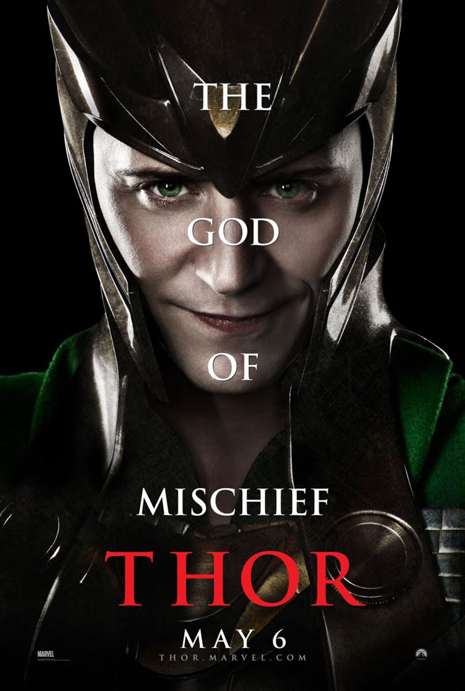
Though the image is striking because it is all in red and head on, there are problems. The image is good. The intense determined look makes it so you can’t look away. But, the red is too intense. This vivid red haze is obnoxious and unsettling. It should be lighter so the gray and metallic show through, a light haze instead of drenched in red. That would be more stunning. I also really dislike the words down the center of the photo on his face. It is uncomfortable, distracting, hard to read, and the font is bad. I especially hate the word “’GOD” on his nose. I would have much preferred to have the words going down the side of the photo vertical or horizontal. Either would have been better than this. Unfortunately whoever came up with this must have thought it was a good idea because they made a series in the same composition.
The only one of these that looks acceptable is the one with Natalie Portman. If the words were shifted to the viewers left it actually would be good. The use of her profile was a good idea. It makes the words less intrusive. The other two just look silly. The words cover their face and cheapen the photos. Not someone’s best idea, especially for a campaign.
The font for the title is perfect. I especially like the way the R is. It really balances the word and adds some interest to the title. On the other hand the font used for the face words is bad. It is silly, cheap, doesn’t suit the photo in mood or message and over all just lessens the impact of the image.
Though I don’t have many good things to say about the posters I loved this movie. Unlike the awkward posters the movie was stunning, enthralling and exciting. I loved it! It is officially one of my favorites. This sort of movie is right up my alley and I love Chris Hemsworth and Natalie Portman so I might be biased J I recommend it to all.


I agree completely with your feelings on the Portman poster. I feel like the words right across the faces of the other actors looks a little cheesy. I've never seen this movie, but I am definitely interested now!
ReplyDeleteI agree that the words down the center on a head on photo was a poor choice. It's unflattering and the word placement is awkward. It also appears that they just used a default font, which is lame. The poster of Portman was definitely the best. Overall I think the posters do give off the same intense vibe that the actual movie has!
ReplyDeleteI definitely agree that the top poster is the best, by far. It uses the same red that the second one does, but in a much smaller, and thus more tolerable, amount. Overall, I agree with the author: the posters themselves aren't all that great. I haven't seen the movie, but the posters don't intrigue me too much. They're pretty generic.
ReplyDeleteIf the internet is any indicator (I've been told that it is) then I'm the only person in the world who liked the God - of - Thunder poster. I loved the red and intensity of the look that Thor has. Admittedly though carrying out that same template for all of the other character posters was kinda silly. By the time you get to the Natalie Portman poster the whole design seems more like a MAD Magazine send up
ReplyDelete