Wednesday, November 30, 2011

Spider-Man


Oh how I love Spider-Man. My love for Spider-Man is as vast as the oceans. Haha Just kidding, but I really do love Spider-Man. I enjoyed the first run of movies but I’m pretty sure this new reboot is going to be way better. Spiderman is supposed be more witty and sarcastic than Toby Maguire’s version. I think Andrew Garfield will be more suited to the role.

The new and old posters are very similar. But, I like the old one better. The whole half black half red thing aside I don’t think it is necessary for words on the image. The Spider-Man logo is so iconic it isn’t necessary. Putting words make is almost insulting to the audience’s intelligence. It is important not to be awkwardly obvious, it is insulting. Other than the words both are similar in style, though the newer one (the one on the left) if more vibrant and lit from the front.

In the case of the new poster the words are not even clear. They are ill placed. The highlight on the words makes them even harder to read than does the thin small font. I really can’t believe no one thought that was a bad idea. It is so obvious. You can’t even read it. The 2012 is probably the only acceptable text.

Though the font and style of the words are atrocious I will see this movie. Mostly because I still love Spider-Man regardless of what silly things people do to his logo. 

Paris, Je'taime


This is an interesting poster because it really isn’t a photo. It is more of an emblem or logo. The image is created with a million little Eiffel Towers in the shape of a heart. It like the weathered look of the paper, it’s different. The border created by the words all around is really intriguing. The reds with the pink under tones are very nice.

The border on this poster is a great idea. Borders in my opinion are generally better off broken but when the poster is mainly text and a very strong well developed graphic element a border may actually be a good idea. Making the border words breaks the border up so it isn’t too harsh. A solid border would be way less effective and distracting from the overall message and feel of the heart element. Even though this poster is in French I think its simplicity and subtle complexity can speak to everyone. Images surpass language barriers.

I would see this movie just out of curiosity. I want to know if it is as visually stunning and creative as the poster.

The Help


Haven’t seen this movie, though I heard it was good. Plus, it has Emma Stone, so that’s a step in the right direction.

This is a nice poster, and not because it uses my favorite complimentary color scheme. I also love how the title is so large. Most posters keep the title more in the middle range. It is nice to see one that is obviously prominent and a picture that supports. Another thing I really like about the text is how the “the” is enclosed between the “H” and “L”. It is compact and clever. I love it great idea. The yellow monochromatic background is a good setting, subtle, and emphasizes the title.

The best part of this is probably the way the character is positioned. Although they are staged they almost don’t look staged and each stance tells us something about the characters. Their positioning and head levels also create a nice curved implied line that helps your eye travel around the page. Their dress colors even flow well with the image. The attention to color is much appreciated in my eyes. I love it.

The tagline “change begins with a whisper” is perfect. It tells us just a bit more about the movie and emphasizes the title and positioning of the characters. This poster is subtly genius and I love it. Perfect. Absolutely great. I really hope the movie is a well done and fantastic as this poster.

Wall-e


Pixar can do no wrong. Except with Cars, that was a mistake. But that is beside this point. Wall-e has a sweet poster. It is so cute, so pretty, and interesting. The Wall-e character is adorable. His raised waving and hand and wide eyes looking at the viewer are captivating. What is amazing about this is the expression depicted in a little robot. This robot is made of junk, yet it is still adorable. Good job Pixar. Other than their excellent character development the color scheme is perfect. It is a complimentary color scheme consisting of Blue and Orange and since Wall-e is a little orange the emphasis is on him. Excellent. The giant edge of the planet that can be seen in the background is also a wonderful element. It keeps your eye drawn in a circle and thus keeping it focused within the poster, and frame.

The way the title is written is also great. The font is very mechanical. The dot between the “wall” and the “e” gives even more of a techy feel. The name itself wall-e is cute and the red around the “e” was a nice touch. The word and image work well together and really give you a feel for the movie.

I haven’t seen it all the way through, but the part I did watch was adorable, entertaining and visually stunning.

Even though Wall-e is adorable and pretty great it doesn’t look likely he is anywhere near as awesome as this dynamic robot duo J

Singin' in the Rain


 I really like the font for these posters. I actually like that the designers used a text effect (that swooshy wavy motion the words make). With this particular poster it’s cute and very fitting to the movie and rest of the poster. I would say most of the time you are better off using a different style font rather than a shaping of the word effect but in this particular case, it was a good idea. It goes with the dancing singing story line.
Another good thing about these is the movement. Energy leaks from every pore, just like the rain J 

Energy exudes from their faces and body language. Gene Kelly holding onto the light post singing is drawing the viewer in and involving then in his experience with the body language. The yellow slicker poster does the same. Both are eye catching because of the positive emotions they make people feel. Just like the song and dance numbers! http://www.youtube.com/watch?v=D1ZYhVpdXbQ

These posters have more to offer than just energy, good design. I will be hanging this on my wall!

Tuesday, November 29, 2011

March of the Penguins


Adorable. There are so many wonderful things about this poster. This poster, unlike lost in translation, does a good job of giving more information in the title and tagline
.
Making this poster good was very important. It is not the normal type of movie you would see in a theater so making the poster this awesome was a good move.

The implied lines of the image are beautiful. They really lead your eye around the image and back the other way again. It is even more perfect that the penguins are looking at one another and their bodies create a nice curve around the image. So perfect.

One thing this poster does that normally doesn’t work that well is the bolded letters. Normally it is not recommended to bold some letters and not others it generally creates disconnect. But this is a way to do it and do it well. By stacking the title and making sure March and Penguins are bolded and on top of one another connects them ad makes them flow and stand out. All the words in all caps also help this flow better. It also works because of the length of the title and being able to have two bold words and two not.

This poster can’t get more perfect. I would hang this on my wall and I would see this, because of the poster. 

Lost in Translation


This is ok. It isn’t bad, but it isn’t great. It doesn’t tell me much but it doesn’t deter me. This poster relies too heavily on the fact that Bill Murray is in the movie. Of course that is a good selling point but the viewer needs to be given a little bit more than just an actor and a five words. In this case the words are redundant even. Lost in translation is the title and the words read, “Everyone wants to be found.”  It is saying the same thing twice. Together they are redundant. The title and phrase if on the same poster should tell you two things or at least one should expound upon the other.

The content of the photo, although not bad is vague. Yes you don’t want to be too specific but this is too vague and does not entice my imagination.

The one good thing about this poster is Bill Murray and his expression. They way he looks directly into the audiences eyes, is perfect. He demands your attention and draws you into the story. It is probably the only thing that makes you wonder. I can’t help but wondering what he is thinking and why he is feeling this  way.

So good job Bill Murray he saved the poster. 

Identity


This was a neat idea. Props for being super creative. It is perfect for the title and I’m going to go watch the trailer and make sure it has the right feel for the movie. But if the movie is kinda creepy and definitely suspenseful, or maybe even a horror movie we have a winner. Standby.

Ok I watched the trailer. Yup, they got the feel right. It looks creepy as hell. Idk if it was actually a good movie or not but I’m a little scarred. Ok… maybe more than a little, but I might be a wimp in that regard J.

Back to the poster it’s a lovely dark black and red handprint. Nice, how else to people find killers besides with fingerprints. That is basically what they look for first. Nice thing to reference. Subtly morphing the fingers into people makes it even better. Referencing Identities of at least four people maybe five because the middle of the hand looks like it could be a face too. The finger people. Nice making them look like corpses. They look like they are either hanging, or ghostly walking. Either way the mystery is what makes that work. If you could tell right away it wouldn’t be nearly as intriguing. Since it is a mystery thriller it also makes the “mysterious” looking “people” perfect for the movie.

Red. Nice touch, always a subtle nice way to set the thriller mood. Makes you think of blood. Blood on a handprint is even better. This poster works so well with the title. It gives you such a good feel for the movie. You know exactly what you are getting into without actually knowing. Perfect. I love the suggestions it give the viewers mind.

My only issue with this is that I would not have put it on a white background. It’s to clean. Maybe white with smudges something to break the white space. Or maybe even a hazy gray background. That probably would have worked better. The second thing I might suggest is blurring the edges of the hand just a bit. It is a murder related story so make it a bit messier, a bit more frantic. That would push it over the top from great to awesome and completely memorable.

Overall a Identity has a great poster. Yes, it has maybe one or two areas in which it could improve on but overall the feel and message are perfect. That being said I probably won’t see it. Not because the poster isn’t good but because I’m might possibly be a bit of a wuss as I mentioned earlier ;) 

Iron Man/Captain America


Although the Iron Man and Captain America have the same feel, which is good since they are an Avengers movie with both characters in it that looks amazing scheduled to release in 2012. Both posters have a feel of power and intense determination. The similarities come with the feel and emotions present in the posters and movies themselves.

The iron man poster is wonderful. It has a fabulous glow around the whole thing that mimics the glow from his chest and source of power. With the rest of him darks reds and grays and purples the yellow orange glow stands out perfectly. The glow is also mimicked in the Title as well making it noticeable too. Your eye is really drawn to his glowing eyes and glowing chest. Perfect since that is what them movie is about, the man behind the mask as well as the source of his power. There is also so much movement. His stance and with his knee brought up he looks like he is coming for you, or someone.

The same movement, strength, and glow is also depicted in the Captain America Poster. His strong stance and firm placement as well as the bits of things flowing in the background give the illusion he just slammed his shield into the ground. The silver glow present in this one is reflected in the words and shield. This poster is strong and intense. This stance show gives the feel of a great burden as well as an incredible will to succeed.

Another similarity between the two other than feel how each character breaks there frame.  A very good use of design is having characters break frame. It gives the characters presence in your world and vision. It makes it more relatable and striking for the viewer. By breaking the frame it makes them seem more lifelike and helps create more visual interest and lead your eye around the page. This is a trick commonly used by artists.
In addition to the impressive posters the movies are also stunning and exciting.

I loved both movies as much as if not more than the posters. Most characters are well developed, interesting, relatable, and entertaining. The storylines are stunning, intriguing, and emotional. 

Sunday, November 27, 2011

The Artist


Who knew black and white could be so appealing.  This is so beautiful and so simple. I love it. I don’t know the movie but I want to see it now, and I hope it is as wonderful as the poster.
The angle their gazes create is perfect. His downturned head and her upturned face create an excellent diagonal line that crosses the page and draws your eyes around the page.  Their shoulders mimic the angle and so does the line where their bodies cut off.  The light highlights their face and helps them stand out from the dark background subtly. This makes it intriguing and sort of seductive.
The font choice is perfect. It is artistic and simple. The red “the” is a nice subtle touch of color. This is so simple and so nice. The passion in their eyes is mimicked in the layout, lighting and font. This whole poster is wonderful and romantic.

Shawshank Redemption/Crash


I’m so glad this poster is amazing because this might just be my favorite movie ever. Although it was a long one it was so interesting and emotional. It had such a captivating story and throughout the whole nearly 3 hours I was enthralled. This poster never ceases to appeal to me. I don’t want to look away from it. I will buy this and put it on my wall.

Although the man is facing away from the camera there is so much emotion in this picture. This angle is made dynamic because of the way it is lit and the back view is not an awkward angle, unlike the old Footloose poster. Even though we can’t see his face his body positioning expresses freedom and relief, and the rain storm in the glowing light is cleansing. The relief in this photo is catching. It is very indicative of the movie. The joy at the end and the emotion within the story are projected in this poster. The font and location of the title is simple and perfect for the image. It doesn’t take away and only adds. The caption at the top spikes interest and directs the images emotion. This image just shows how important body language is and demonstrates that sometimes, if done right, you don’t need a face to express emotion.

This image for the movie Crash reminds me and seems to reference the Shawshank photo.  I think the correlation exists in the projected emotion. Both are incredibly emotional, though I believe they are completely different. While Shawshank is relief and joy based crash looks riddled with pain and frustration. Both make you feel something and both are dramatically lit. Crash is lit from behind the head so you can see the agony in the man’s face, but Shawshank is lit from the back side eliminating his face, but getting across the same intense level of emotion. Both posters also have a tagline that I feel sums up the general feel and content of the movie. Both posters are set up very similarly and have a very similar use of emotion and may to evoke it.
One unique thing about the Crash poster is the way the names of the actors are listed. It is great. It is interesting; the names are positioned artistically so your eye is drawn to them. You want to read them but they are not distracting to the overall message and emotion. It is a wonderful poster.

I love both of these posters. They are art. Their style and ability to capture and evoke an emotion from the viewer is so far without comparison. I love the contrast in types of emotion when they are compared. In my opinion the Shawshank poster is just a smidge better. It gets across the same amount of emotion as the Crash poster but without a face. That is more difficult to do, and makes the image more interesting. 

THOR

Thor has a multitude of posters. Some of them good, some bad, some with good foundations, and some that are questionable. The coloring and composition of the photos are excellent. The colors are dark, rich and metallic. They have a warriors feel and look.
 The above is by far the best poster. The dark silver and metal and the subtle red vibrant cape work so well together. Though the cape is red it does not take away from the rest of the photo. This is most likely due to the light resting on the front of Thor. The angles at which the cape lies and hammer hangs complement each other and emphasize Thor’s straight strong image. Now while this one is fantastic and I would totally hang this on my wall, the one bellow has some issues.

Though the image is striking because it is all in red and head on, there are problems. The image is good. The intense determined look makes it so you can’t look away. But, the red is too intense. This vivid red haze is obnoxious and unsettling. It should be lighter so the gray and metallic show through, a light haze instead of drenched in red.  That would be more stunning. I also really dislike the words down the center of the photo on his face. It is uncomfortable, distracting, hard to read, and the font is bad. I especially hate the word “’GOD” on his nose. I would have much preferred to have the words going down the side of the photo vertical or horizontal. Either would have been better than this. Unfortunately whoever came up with this must have thought it was a good idea because they made a series in the same composition.


 The only one of these that looks acceptable is the one with Natalie Portman. If the words were shifted to the viewers left it actually would be good. The use of her profile was a good idea. It makes the words less intrusive. The other two just look silly. The words cover their face and cheapen the photos. Not someone’s best idea, especially for a campaign.
The font for the title is perfect. I especially like the way the R is. It really balances the word and adds some interest to the title. On the other hand the font used for the face words is bad. It is silly, cheap, doesn’t suit the photo in mood or message and over all just lessens the impact of the image.
Though I don’t have many good things to say about the posters I loved this movie. Unlike the awkward posters the movie was stunning, enthralling and exciting. I loved it! It is officially one of my favorites. This sort of movie is right up my alley and I love Chris Hemsworth and Natalie Portman so I might be biased J I recommend it to all.

Thursday, November 10, 2011

City Lights


What a cute poster. I have not seen this but the poster makes me want to go find it watch it and hang this poster on my wall. It is well designed, fun and happy! The colors like the breakfast at tiffany’s poster are primary, but work really well. The font is very indicative of the time period and suited to the film. This poster also uses the rule of thirds, just as the last one did. Bu this one uses it horizontally and in opposite. The words for this one are in the smaller third. But because of their size, it works. One of the nice things about the word City Lights is that they extended the Y and G off the page. It is always nice to break barriers. The silhouette image of Charlie Chaplin mimics the black behind the words and ties it together. The image has a ton of leading lines. The lines the buildings create down the middle, the lines from the lights. The lines lead into the city and then the lines that create the vertical buildings lead your eye to the words. Leading lines are beautiful! Especially when they are implied! There are not many of those in this little masterpiece but the lines are nice nonetheless. Again don’t know much about the movie, but it its Charlie Chaplin, so it’s probably pretty awesome J

Dark Water


This is a very vertical poster. And by vertical I mean the imagery.  Most poster are more horizontal based so this is particularly attractive and interesting. And look at that creepy woman….. paired with that dark font you know this is some sort of thriller or possible horror movie. It also uses the rule of thirds, one third to the left with the woman in the door, two thirds with the words. If it were half and half your eye would not know where to go and it would have no movement in the image. The artists of this do a good job integrating the 1/3rd and the 2/3rd the vertical white lines reflected from the door and the water. The image works really well with the words and the title. As I mentioned the font matches the feel well and implies the proper context but the image also mimics the words. Dark water. Hey, looks what’s in the picture, dark water. And to make it more creepy that woman in the doorway, her gaze that is directly at the camera and the viewer  makes it more creepy.  The lines in this image are fantastic and this is one of the best divisions in a poster I have seen. The division between word and image is fluid and inventive. I have not seen the movie but by sources tell me the movie is pretty mediocre and doesn’t live up to the poster. I also watched the trailer and it look ok but when the threat is dark colored water……. That doesn’t seem horribly scary or terrifying. The trailer lacks what the poster has.

Thursday, November 3, 2011

Children of Men


This is a wonderful, intriguing, chilling poster.  The font is lovely. The breaks in it reference the biohazard font and the smudges imply a problem or mess, something apocalyptic. The four red statements tell you all you need to know about the movie and the layout and style just enhance the gravity of the implications and the feeling of the poster and the movie. The expression on Clive Owen’s face as he looks through the class is one of worry and concern as well as resolve.  The lines from the broken class are what lead you eye to the words. Your initial gaze goes toward Clive Owen’s face and the expression in his eyes.  Generally eyes in any image are where your eyes go first. It is what people recognize as human, it is what they connect to first because your eyes truly are the window to your soul. The broken glass, referencing a broken dream, society, or hope, has beautiful lines that take your eye away from him and too the words and the title. It explains his expression and the font the words weight, meaning and understanding. Yes, font does have that power. Imagine those words written in the stupid curly font everyone likes to use. (If you ever want to be taken seriously don’t use that font. Most professionals will not appreciate it.) If it was written in that font you would be confused and the movie be given the wrong mood.  Mood is incredibly important especially in a poster where all you have is a moment to capture a person’s attention and only a moment longer their interest.

This is a great poster for its mood and its incredibly appropriate font. In the visual world font is possibly the most important element in an image with words. Be aware of it. It can make or break a mood or a purpose. 

Tuesday, November 1, 2011

Winnie the Pooh


This Winnie the Pooh poster is fantastic. It uses white space perfectly. It is primarily image and it works wonderfully. One of the reasons this is possible is because the characters are so iconic. Everyone recognizes the characters and so words are not necessary. By dividing the page into 1/3 white and 2/3rs white the rule of thirds is used and creates visual interest and by making the image of the characters small in comparison to the honey river it emphasize them and their journey. Their gaze looking up creates a line and makes them smaller. The way they are dressed and positioned lends itself to an adventure. . Pooh at the helm of the honey bucket references many explorers going off into the unknown. I have not seems the movie but it seems an adventure is evident.

The white space (space not dominated by image, so this includes the honey) it what creates most of the feel. It is slightly over whelming, but not necessarily in a negative way. It draws you in, but also makes you wonder what is contained outside the poster. The space creates so much intrigue and a definite feel and excited mood to the poster. 


Angles are important in this image, the tilt of the jar, the gaze of the characters. All the characters are looking and the angles are pointing up. It makes you wonder what they are looking at. They look so small but strong.  The poster makes you wonder what they are looking at the coloring give you a fun feel.

I had no intentions of seeing this movie, but the poster is so well done and so intriguing that now I think I will.

Wednesday, October 26, 2011

HANNA


Hanna. Can I just say that Hanna has such a lovely appropriate font. It is perfect for the movie and the poster. It is nice to see a poster with a font different from the standard range of Helvetica seen everywhere. The font has a tight wild feel. It draws your attention to the name but also blends nicely with the image. The image is wonderful. If you notice the image is 2/3rds text. And this works. The girl’s icy stare looking directly into the camera is unsettling and intriguing. In photos people tend to go toward eyes first. And in this case she is staring directly at the viewer and you can’t help but stare back at her mostly covered face and penetrating, mysterious, blue eyes.  Her arm also creates a nice angle coming toward the viewer and then you notice she is aiming something. That makes the image more powerful because of the dramatic effect it applies and the context it gives to the stare. This poster is great because of use and style of the font as well as the close up direct stare. You don’t see such an intense stare often and it really draws the viewer in and makes the movie seem intriguing. Then, paired with the trailer, there is no stopping this movie, or Hanna. This movie is just like the poster, intriguing and intense. I loved it and recommend it to anyone into a good action film. 

Tuesday, October 25, 2011

Inglorious Basterds


Inglorious Basterds. What an awesome movie. And what does any awesome movie need? An awesome movie poster. This poster is wonderful. Is says all you need to know about the film. It screams Nazis are going to get their sh*t rocked. Let’s start with the background. Stormy clouds. It is simple enough not to distract from the foreground image and ads just enough depth to make the image stand out. Notice the lighter parts of the clouds are right behind the image. This positioning is for emphasis. Your eye tends to go toward the lighter part of the image.

The words at the top written in white, “once upon a time in Nazi occupied France,” are perfect for the story as well as the poster.  The “once upon a time” implies maybe some dark humor and the second part of the line also give us the location and a bit about the story. Nazi Germany. We now know it will be a war related movie. And as we know, everyone likes seeing Nazis get their butts kicked so who’s not going to love it.

Now for the image. The image itself is awesome. First off the bat creates a nice diagonal and goes off the page. It really draws his eye into the photo. The helmet hanging from it is powerful. Because it is beaten, battered and dripping with blood while sporting a Nazi logo it implies and event that would involve it having been taken off a dead Nazi soldier. The diagonal helmet also matches the diagonal of the bat. The battered, name carved bat is also covered in blood. With the helmet swinging from it is applies some nasty violence. 

Just by seeing the poster I think it is also safe to assume the movie is rated R and not for the faint of heart.  
As you may have guessed, I have seen this movie and it is awesome! It has an interesting story, it is beautifully filmed, has some quality violence as well as characters you can really root for. Overall the poster and the movie are amazing. 

Thursday, October 20, 2011

American Pie


The poster for American Reunion is pretty awesome. It is very simple and very dynamic. It uses white space and text very well.  The simple phrase at the top breaks up white space just enough.  The diagonal and angle of the stamp like letter is perfect. A diagonal is always a wonderful way to direct the eye and create interest. The pie replacing the “0” was a very good idea. The pie references the first movie and the other movie posters. The pie is a recurring image on all the promotional work. So, although this is simple it gets the idea across and makes it obvious to the fans of the movie what the movie is without overly stating the title. The way the “2” and “12” seem stamped implies a journey because of the travel stamp like lettering. This is nice because it can be any type of journey, emotional, physical or life journey.  The angle at which the picture of the pie replacing the “0” was taken also makes the poster more intriguing. It gives the picture more depth and draws the viewer in. The poster itself references the previous movie posters with its style and imagery. It is especially referential with the pie. The pie is iconic for the movies.
 The other posters in the promotional series are set up very similar to the earlier posters. The photo itself is actually the same as the original American Pie photo. The photo is just set off center and tilted to the side. This is probably the only poster without a pie. Since it is very similar to the original it works. Just by rearranging things a little and changing the sizing the poster look new.
 

Wednesday, October 19, 2011

Contagion/SAFE


The treatments of a poster is another effect often employed in giving a feel to an image. In the case of the Contagion and Safe posters they both are text heavy and sport a very weathered look.  Text is very powerful. People react very strongly to it and in many cases will see text, or try to see text in abstract shapes. Words are incredibly powerful and recognizable. 

Both posters have a weathered look and feel. This mood is translated though the torn edges, seemingly crumpled dirty paper and faded rough edges. The mood is weathered, old, and struggling. It is a good feel for a movie that is apocalyptic and a movie that is about an abduction. Both posters give a rough feel and seem to reference some sort of struggle. All this is done with only text. Safe has a small image, but it does not give much information and is not the prominent image.

The safe poster is good and has similar feel and style as the Contagion poster. But, the Contagion poster is so much more intriguing. The way the word Contagion is created with the faded letters from well known important cities around the world. The horizontal vertical juxtaposition is very interesting. It visually keeps your eyes moving and emphasizes different things, the cities and the title. Then as a lovely finishing touch the bio-hazard photo at the top brings it all together. That small sign partially off the poster does so much. It sets the mood and gives most of the information. That sign tells you the importance of the listed cities and what is going on. The worlds of this image create a powerful image in the viewers mind. Being able to create such a powerful image and concept with so few words is wonderful. This poster is so powerful visually and within its implications. Working with all text is difficult, but this poster is a wonderful example of how to handle it. 

Thursday, October 13, 2011

Ides of March


The Ides of March is coming out this Friday night. It stars Ryan Gosling and George Clooney. The poster for this movie is amazing. There are quite a few versions of the same poster, all of which are pretty great and work well on their own accord. The difference between them is sizing, cropping and amount of words. The image in most is the same.  All versions are incredibly creative and imply so much. This poster has mastered the art of implication.

The most important feature of these posters is how well they give a synopsis of the movie with minimal words. Most of the information is portrayed though image, font, and color. The more image driven posters give a little less information. The simple image of Ryan Gosling with half of his face matched up with the other half of George Clooney’s on a magazine says a lot. While as we all know I haven’t seen this movie but from this image you can imply a few things. We know this movie is about a presidential race. The half image being on time magazine implies that. Notice how we don’t see all of Time’s title. The title is just implied by seeing part of the word. Letting a viewers mind fill in gaps, leading them to the full picture or idea, but not giving it to them is wonderful. It makes an image or design intriguing. It makes people want to look at it more. They may not know why, but that’s it. By having the two faces and by having the other two images blurred next to the clear one say a lot as well. The two faces can imply a connection between the two. It can also imply one having influence over the other. The blurred images give unease to an otherwise clear cut image. It suggests unease, tension and something unknown. Ryan Gosling’s character may be planning something unknown, some covert mission. The title itself implies some sort of coup. Ides of March. Ides of March references the assassination of Caesar and the conspiring against him. Something will happen between the two men in the picture. Another thing we can gleam from this image is that the story will be centered a little bit more around Ryan Gosling than George Clooney. We can tell this because the image is predominantly Gosling.


The font, font size, words, and colors also imply a presidential development. The red whites and blues are indicative of the United States.  Nothing says American like red, white, and blue. The font style is also very similar if not the same as the fonts used on campaign posters. The emphasis on the stars as well as the placement also implies an American/presidential plot point. The varying sizes of the words also create interest. Everything is on the same plane and the long lines are simple and mimic those of campaign posters.  The only words I would change are the quote they used from a critic. It does not fit well with the image or say anything overly descriptive or intelligent.

All versions of this poster are wonderful. The colors are fantastic. They are Obviously American but the tints of them make it not uncomfortably blatant. The image is intriguing and keeps you looking. The title is fantastic and implies so much, just like the image. All in all, the poster is fantastic. The trailer is also very good and exciting.  I will definitely be seeing this movie!

Wednesday, October 12, 2011

Breakfast at Tiffany's


Breakfast at Tiffany’s is a popular movie made in 1961. Its air date was preceded by a few wonderful movie posters. The two I found are particularly wonderful. Both of these exhibit the proper way to use a border. In my last post I mentioned that one of the posters had terrible usage of a border. Well here are two examples of a situation where the artist used a border and it enhances and ads to the overall image and message.
In both posters the border is breached by some part of the image. A border tends to work best when the inner image breaks the barrier just a little and comes into the viewer’s space. In the first image Audrey Hepburn’s hair and arm breach the barrier along with the small image of the man and woman kissing. The perfect amount of image is hanging over the border, just enough to bring it to the foreground. By breaking up the border the picture is more noticeable.

Another bold move the designer made was by using primary colors for the color scheme.  Normally this is bold, childish and distracts from the overall design. But in this poster it works very well. The simplicity of the image works well with the colors. They are used in small amounts and in the coloring is not the true hue. The colors are the tints of the hue. That softens their impact and lets them seem less “primary.”  Another good use of the colors is how they place Audrey Hepburn near the red and yellow boarder in her black dress. It makes her stand out and because of her black dress black dress your eye is drawn to the words and her name. Since the red and dark pink are in the same color family the pink makes the title also well noticed. The other image on the photo which is drawn in grays sits near the blue border. That keeps it muted a little. Making it noticeable but not having it stand out more that Audrey Hepburn’s image.

In the second poster the same color scheme and color similarities and emphasis trick are employed. The bolder close up image of Audrey Hepburn is stunning. Her hair brings out her name and the lines created by her line of sight and the line of her cigarette draw the viewers eye to the side and up to the title and name at the top. The way the eyes go toward the edge and down the cigarette to the boarder. Where the lines of the border and the cigarette interest it creates a strong line. The way in which your eyes travel up to the small image, and then to the words is dynamic. Implied line is one of the most dynamic elements you can use in a design. It draws your eye all around and emphasizes certain things. It is what makes images interesting and intriguing and makes you want to look at them.

Both posters are fantastic. The implied line and the smoothness of the poster and the use of white space is wonderful. There is so much white space in this picture and every inch of it works well. It does not distract and completely enhances the words, figure of Audrey Hepburn and the smaller image of her and the man. The contrast in size of the image is also dynamic. It emphasizes Audrey Hepburn, as it should.
This poster works stands out because it employs a few design elements that would normally be things to avoid in design. They use them and use them well. They employ them in a very effective eye catching way.

Thursday, October 6, 2011

Footloose


   If the movie posters for the Footloose remake are anything like the movie than it appears it's going to be  terrible with maybe one or two redeeming features. I've only seen the older version of the movie and actually wasn't a fan, but the dance numbers were very fun even though the story line is lacking.
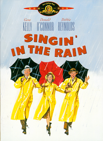
   Let’s start with the old poster. It is a very unflattering poster. Yes there is movement, and some emotion that can sort of be seen on his face. But a picture where your butt is the prominent object is never a good thing. Your eye is drawn to the white of his shirt and down the back. This is a good example of why it is important to be careful when using light colors. They are generally very very obvious and catch your eye almost immediately. With this photo especially the way it is shot and colored white plays an important role visually. With the particular angle of this photo your eye is first drawn down so back of his shirt down to the bottom of the page. You want the eye to move up to the title, but it does not. The border is also useless. It separates the picture from the movie information. It separates it too much so much to the point where it isn’t even noticeable. The good thing about this poster is the font for the title is very appealing and goes well with the word. The title, Footloose, is written in a loose, flowy, jaunty font. It suits the movie well. The image also tells you very little about the movie. The man in the photo is dancing. It appears to at least involve music and dancing and the tagline says a lot about a main character.
   This poster could be improved very easily. All it would really take is to retake the photo and just rotate the dancing man so he is facing the camera just a little bit more. That way the focus would be on his face, his movement and emotion. I would also make the tagline shorter or get rid of it all together along with the border. The border if necessary could stay if it were smaller and a different color. This poster is close to good and just a few minor changes could have make it great
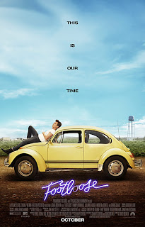
   The new poster I believe is worse than the old. It looks too much like an ad. The wonderful thing about movie posters is that they are ads without the ad look. They sell you something but in good ones you are completely unaware, only excited for a new visual treat. This poster is probably the best of the set but is still awful. The one good idea they had with this poster is that they did a set of footloose posters with in a series sort of like an ad campaign. Unfortunately all the photos like the one shown above are not very good in content or quality. They squandered and intelligent movie poster campaign idea. The benefits to this are that it keeps the movie goers continually interested in the poster and intern the movie. The images themselves are unclear and tell us nothing about the movie. It seems the focus unlike of the movie unlike the old is not on the dancing, but I may be wrong it is just what the poster conveys.
    The nice things about the poster include the focus on the emotion and the “cutloose” written down the side. It gives it some visual interest. This photo in particular has a nice diagonal with the girl’s outstretched arm. At least with the new poster you get a sense of the characters personality. The posters also do seem to imply that the movie will be a little more of a drama. Not a comedy or an action. The old poster had little more of a lively feel to it than the new ones. Based on that information it seems the feel of the new movie may also be different. 
  I'm not sure there is a way to fix the new posters. I would keep the "cutloose" campaign idea since it is catchy and focus more on the movement since it seems that is what people want to see. The appeal of this movie is not the story line or really even the characters but their actions and movement (or dancing). I would stick with the images closer to the old poster, but make them more dynamic and throw in one or two other images that were not of dancing or movement. Bellow are two images/posters I found for the more recent footloose that are very nice but for whatever reason not commonly used. 

   Both of these are very visually dynamic. The one of the dancer is compelling. It makes the viewer want to do something, dance or maybe even to go see the movie. The second shows a different side to the movie or more personal character image and is still dynamic. Something needs to be done about the words but the simple layout and the simple relaxed pose of the man on the car is intriguing. I don't know why these posters are not used more. They are way more compelling and infinitely better than the others.

Wednesday, September 28, 2011

50/50


50/50
   The promotional movie poster for 50/50 starring Joseph Gordon-Levitt and Seth Rogan has a wonderful design. The image conveys a lot of emotion, but is clear and simple. There is minimal text on the image and the expressions of the actors are the focus. The coloring is even muted. The muted color puts the focus on the facial expressions and the emotion. The actors are arranged in a diagonal. Diagonals in images are very dynamic and wonderful to use when possible. They are two main diagonal lines in this image that draw your eye in a line across the page from top of the heads to the words, and also from shoulders to the faces. Because the title is a number, and we are used to seeing words it does not have to be terribly prominent. The break from the norm is enough to make us notice. Its position set off by the white box at the bottom is emphasis enough. The grey toned words set the title apart from the other words and off the white background.
   The action in the picture is intriguing. The type of action, the shaving of his head, makes you wonder about the content of the movie. The facial expression further emphasis this. Why does Seth Rogan look skeptical and maybe disgusted? Why does Joseph Gordon-Levitt look worried and focused? What is causing these actions? This image provokes thought and makes the viewer wonder. It invites the viewer into the story. The simple words at the top are in a calm, all caps font set off by their white coloring. They are not large but because of the diagonal lines they are noticed. The simple tagline is enough. In combination with the expressions lets us know this will be an emotional, yet entertaining movie. This will most likely attract viewers. It tells just enough information to be interesting without overdoing it. This is a close up image is simple in comparison to most other posters and because of that will stand out amongst the rest. Thus far this movie seems well advertised. The poster is well done, nontraditional, and the trailer is out there without being over played. 

Tuesday, September 27, 2011

Drive


This movie poster came out somewhat recently. It is for the Drive. The poster I am referring to is shown above. It is very dynamic. The image is both intriguing and thought provoking. It leaves the viewer wondering, what the movie is about, what the man is doing and the meaning of the scorpion. Ryan Gosling poses with his back facing the camera. This pose emphasizes his jacket and the scorpion on his back. The emphasis must mean it is important. His outstretched arm creates a nice diagonal to the picture. It draws your eye from the yellow scorpion to the edge and up to the words. The yellow in the figure in the window also helps draw your eye away from the scorpion focal point and up to the title. The complimentary color scheme of yellow and purple tints, tones and shades, along with a nice white neutral is pleasing to the eye. The colors don’t cause any sort of discomfort. They are rich and calm. The yellow is what draws your attention because it is brightest and used the least around the image. The bold font is perfect for the single word title. The title being in all caps leaves it imprinted in the viewers mind. His face reflected in the mirror shows a small bit of emotion and the distorted reflected image gives the perception of some sort of problem, or confusing situation. The lighting is also striking. The main light source from the side creates a very dramatic feel.  Although this poster doesn't give a whole lot of information about the actual movie the viewer does know Ryan Gosling is in it, it was in competition, and the viewer also gets a good feel for the mood or overall feel of the film. This is a very dynamic poster with a well depicted and emphasized mood and sense of mystery.