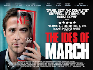
The Ides of March is coming out this Friday night. It stars Ryan Gosling and George Clooney. The poster for this movie is amazing. There are quite a few versions of the same poster, all of which are pretty great and work well on their own accord. The difference between them is sizing, cropping and amount of words. The image in most is the same. All versions are incredibly creative and imply so much. This poster has mastered the art of implication.
The most important feature of these posters is how well they give a synopsis of the movie with minimal words. Most of the information is portrayed though image, font, and color. The more image driven posters give a little less information. The simple image of Ryan Gosling with half of his face matched up with the other half of George Clooney’s on a magazine says a lot. While as we all know I haven’t seen this movie but from this image you can imply a few things. We know this movie is about a presidential race. The half image being on time magazine implies that. Notice how we don’t see all of Time’s title. The title is just implied by seeing part of the word. Letting a viewers mind fill in gaps, leading them to the full picture or idea, but not giving it to them is wonderful. It makes an image or design intriguing. It makes people want to look at it more. They may not know why, but that’s it. By having the two faces and by having the other two images blurred next to the clear one say a lot as well. The two faces can imply a connection between the two. It can also imply one having influence over the other. The blurred images give unease to an otherwise clear cut image. It suggests unease, tension and something unknown. Ryan Gosling’s character may be planning something unknown, some covert mission. The title itself implies some sort of coup. Ides of March. Ides of March references the assassination of Caesar and the conspiring against him. Something will happen between the two men in the picture. Another thing we can gleam from this image is that the story will be centered a little bit more around Ryan Gosling than George Clooney. We can tell this because the image is predominantly Gosling.
The font, font size, words, and colors also imply a presidential development. The red whites and blues are indicative of the United States. Nothing says American like red, white, and blue. The font style is also very similar if not the same as the fonts used on campaign posters. The emphasis on the stars as well as the placement also implies an American/presidential plot point. The varying sizes of the words also create interest. Everything is on the same plane and the long lines are simple and mimic those of campaign posters. The only words I would change are the quote they used from a critic. It does not fit well with the image or say anything overly descriptive or intelligent.
All versions of this poster are wonderful. The colors are fantastic. They are Obviously American but the tints of them make it not uncomfortably blatant. The image is intriguing and keeps you looking. The title is fantastic and implies so much, just like the image. All in all, the poster is fantastic. The trailer is also very good and exciting. I will definitely be seeing this movie!


No comments:
Post a Comment