Showing posts with label Footloose. Show all posts

Sunday, November 27, 2011

Shawshank Redemption/Crash


I’m so glad this poster is amazing because this might just be my favorite movie ever. Although it was a long one it was so interesting and emotional. It had such a captivating story and throughout the whole nearly 3 hours I was enthralled. This poster never ceases to appeal to me. I don’t want to look away from it. I will buy this and put it on my wall.

Although the man is facing away from the camera there is so much emotion in this picture. This angle is made dynamic because of the way it is lit and the back view is not an awkward angle, unlike the old Footloose poster. Even though we can’t see his face his body positioning expresses freedom and relief, and the rain storm in the glowing light is cleansing. The relief in this photo is catching. It is very indicative of the movie. The joy at the end and the emotion within the story are projected in this poster. The font and location of the title is simple and perfect for the image. It doesn’t take away and only adds. The caption at the top spikes interest and directs the images emotion. This image just shows how important body language is and demonstrates that sometimes, if done right, you don’t need a face to express emotion.

This image for the movie Crash reminds me and seems to reference the Shawshank photo.  I think the correlation exists in the projected emotion. Both are incredibly emotional, though I believe they are completely different. While Shawshank is relief and joy based crash looks riddled with pain and frustration. Both make you feel something and both are dramatically lit. Crash is lit from behind the head so you can see the agony in the man’s face, but Shawshank is lit from the back side eliminating his face, but getting across the same intense level of emotion. Both posters also have a tagline that I feel sums up the general feel and content of the movie. Both posters are set up very similarly and have a very similar use of emotion and may to evoke it.
One unique thing about the Crash poster is the way the names of the actors are listed. It is great. It is interesting; the names are positioned artistically so your eye is drawn to them. You want to read them but they are not distracting to the overall message and emotion. It is a wonderful poster.

I love both of these posters. They are art. Their style and ability to capture and evoke an emotion from the viewer is so far without comparison. I love the contrast in types of emotion when they are compared. In my opinion the Shawshank poster is just a smidge better. It gets across the same amount of emotion as the Crash poster but without a face. That is more difficult to do, and makes the image more interesting. 

Thursday, October 6, 2011

Footloose


   If the movie posters for the Footloose remake are anything like the movie than it appears it's going to be  terrible with maybe one or two redeeming features. I've only seen the older version of the movie and actually wasn't a fan, but the dance numbers were very fun even though the story line is lacking.
   Let’s start with the old poster. It is a very unflattering poster. Yes there is movement, and some emotion that can sort of be seen on his face. But a picture where your butt is the prominent object is never a good thing. Your eye is drawn to the white of his shirt and down the back. This is a good example of why it is important to be careful when using light colors. They are generally very very obvious and catch your eye almost immediately. With this photo especially the way it is shot and colored white plays an important role visually. With the particular angle of this photo your eye is first drawn down so back of his shirt down to the bottom of the page. You want the eye to move up to the title, but it does not. The border is also useless. It separates the picture from the movie information. It separates it too much so much to the point where it isn’t even noticeable. The good thing about this poster is the font for the title is very appealing and goes well with the word. The title, Footloose, is written in a loose, flowy, jaunty font. It suits the movie well. The image also tells you very little about the movie. The man in the photo is dancing. It appears to at least involve music and dancing and the tagline says a lot about a main character.
   This poster could be improved very easily. All it would really take is to retake the photo and just rotate the dancing man so he is facing the camera just a little bit more. That way the focus would be on his face, his movement and emotion. I would also make the tagline shorter or get rid of it all together along with the border. The border if necessary could stay if it were smaller and a different color. This poster is close to good and just a few minor changes could have make it great
   The new poster I believe is worse than the old. It looks too much like an ad. The wonderful thing about movie posters is that they are ads without the ad look. They sell you something but in good ones you are completely unaware, only excited for a new visual treat. This poster is probably the best of the set but is still awful. The one good idea they had with this poster is that they did a set of footloose posters with in a series sort of like an ad campaign. Unfortunately all the photos like the one shown above are not very good in content or quality. They squandered and intelligent movie poster campaign idea. The benefits to this are that it keeps the movie goers continually interested in the poster and intern the movie. The images themselves are unclear and tell us nothing about the movie. It seems the focus unlike of the movie unlike the old is not on the dancing, but I may be wrong it is just what the poster conveys.
    The nice things about the poster include the focus on the emotion and the “cutloose” written down the side. It gives it some visual interest. This photo in particular has a nice diagonal with the girl’s outstretched arm. At least with the new poster you get a sense of the characters personality. The posters also do seem to imply that the movie will be a little more of a drama. Not a comedy or an action. The old poster had little more of a lively feel to it than the new ones. Based on that information it seems the feel of the new movie may also be different. 
  I'm not sure there is a way to fix the new posters. I would keep the "cutloose" campaign idea since it is catchy and focus more on the movement since it seems that is what people want to see. The appeal of this movie is not the story line or really even the characters but their actions and movement (or dancing). I would stick with the images closer to the old poster, but make them more dynamic and throw in one or two other images that were not of dancing or movement. Bellow are two images/posters I found for the more recent footloose that are very nice but for whatever reason not commonly used. 

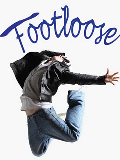
   Both of these are very visually dynamic. The one of the dancer is compelling. It makes the viewer want to do something, dance or maybe even to go see the movie. The second shows a different side to the movie or more personal character image and is still dynamic. Something needs to be done about the words but the simple layout and the simple relaxed pose of the man on the car is intriguing. I don't know why these posters are not used more. They are way more compelling and infinitely better than the others.